Apr 30, 2018

370 3D Level Feedback 1

The final part of the 370 course involves utilizing the Unity engine and its default assets to design a short 3D level. The assigned theme was 'mad science', but I completely ignored any aesthetics and focused entirely on how the level played.


When players tested my level, a few things were apparent almost immediately. The first was that the placement of the camera behind the player was disorienting. I found that it helped judge distances between jumps, but players disagreed. Another issue was that jumps were spaced with little leniency and ended up being too restrictive. Players all too easily missed the next platform and fell into the void. Third, there weren't enough safe spaces a player could fall onto when missing a jump to prevent requiring a restart of the entire level. I didn't anticipate players would fail in certain spots and so did not place anything underneath.

Playtesters also voiced their enjoyment with the level. It provided an adequate and interesting challenge, and had a critical path that was easy to follow. They also noted that it could be exciting at times, which is always a good part of feedback.


Many problems arose from the default player controller provided by Unity for prototyping purposes. It has a very short jump height and poor turning controls. These values are able to be changed in order to perform much more smoothly, but we were not allowed to do so and had to design the level with such controls in mind.

The reason many jumps in my level were outright missed by playtesters involved how the player controller's collision is represented by a capsule. Such a collider affects the nature of jumps in a negative way, especially around the edges of platforms. To explain further, standing on an edge means the rounded bottom of the collider is sliding downwards due to gravitational forces. While this is slight, it prevents the player from reliably jumping off the edge to another platform as they are technically not fully grounded; additionally, the player can hit the edge of a platform and end up sliding off.


In a revised version, I have widened many platforms to give ample room for the player to navigate and give off less of a cramped feeling. I also added more safe spaces to prevent instant failure, and streamlined certain platforms to ensure the player can continue forward without unintentionally falling off or getting stuck on geometry.

Apr 24, 2018

Another 373 Final Project Update

Most models have been completed. There are a few left, like some jars and pillows. The setpiece for our scene, an ornate fountain, has been modeled as well, though it needs more polish. Many items have had their UVs unwrapped and are ready for texturing.


The fountain will continue to pose a serious and threatening challenge. We need to have water, sound, and make it more detailed. None of those tasks will be easy, especially this late into production.


Some extra models I made include some torches (or braziers or whatever). These were much more interesting to make than things like sacks and candles.


I am well within my limits for the tri-count. The most difficult thing to look at will be getting everything into limited UV texture space, as we are restricted to a few different maps for all our textures for all our models.

Apr 18, 2018

373 Final Project Update

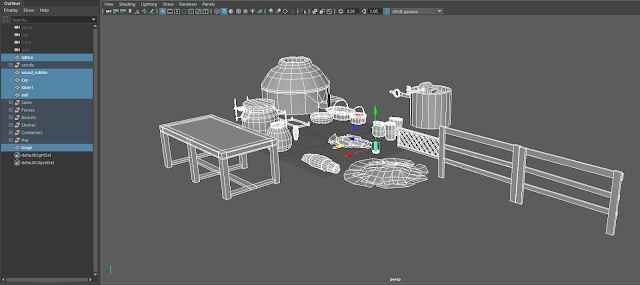
I have completed a majority of the models I was assigned by my team. This includes multiple types of pots, sacks, baskets, shelves, different collections of hay, fences, a table, forge, mill, key, and wood lattice.

What is left to complete entails the fountain set piece, and a few different combined objects, like collections of jars and different types of rugs. Once I complete all the models, I will be working to unwrap all their UVs and eventually texturing them. I hope my team is happy with what I have at this time.

Here are some pictures of my entire collection:


If I complete the assigned objects with time left to spare, I can focus on making a few extra models that can be used to add flair to the scene. What I had in mind ranges from small paintings to other knick knacks.

I foresee the fountain set piece to be quite difficult, as my time is under considerable strain from multiple other projects in different classes. Tri counts are also quite difficult to maintain!

Apr 12, 2018

2D Maze Lv1 Version 2 - Feedback

I did not make very many changes between the previous version and this one. The main issue was the level was much too long, so I just grabbed some tiles in Photoshop and pasted them to cover up the superfluous sections, and blocked it off with invisible tiles in Gamemaker. I also made the foreground and background into one image, since separating them caused some hiccups with all the graphical elements.


Among those who tested the new version of my level, they all seemed to appreciate the streamlined path to the goal. People also previously noted the graphical hitches, and did not make any comment in terms of that, as I had fixed it. Since the level is quicker to solve, there was less anyone could really say about it.

Apr 2, 2018

2D Maze - Feedback

A recent project we started in class is working with pre-made GameMaker assets to create our own 2D mazes. After working to make the level, everyone showcased their level to everyone else for playtesting. In this post, I will be detailing my own level as well as recalling the feedback I received from those that played it.

The assigned theme is 'western' and we have been provided with both art assets and game objects that make the level function. The player character has their movement limited to 4 directions, adding an extra challenge that must be kept in mind as to not make a level that is frustrating to navigate due to hitting walls and barriers.

As I was thinking about the limited movement, I decided to double the size of my level from the initial dimensions. This allowed larger hallways in my maze, as well as a more complex layout. From start to finish and without going through wrong paths, it can take over a minute to reach the goal. Since the intended difficulty is 'easy', many wrong paths are very short and always have a defined marker to indicate its end. I also placed coins on wrong paths that were visible from the main path as to make the player second-guess their choices and play with them a bit.

Players who went through my maze typically enjoyed it. Out of 8 people, only 2 had non-positive responses. Generally, they liked the layout of the maze, with clearly defined boundaries and paths. The two people that did not like the maze found it too complex and that wrong paths led them along too much before revealing their nature. Despite the mostly positive responses, there are areas that need improvement. Those would include reducing the overall size to make navigating the maze quicker, and cutting wrong paths to be less time-consuming.

Next, I will be taking the feedback I had received and making the necessary improvements.