Photography Project - 'Highway Star'
The images follow along the first few stanzas of the song 'Highway Star' by Deep Purple. Ideally, the project would have represented the underlying, non-obvious metaphors embedded into the song, but I went for a more literal interpretation.
Dec 13, 2019
Photography Project - 'Highway Star'
Here is a project from a photography class I took. The criteria was to shoot a set of 9 images that follow the lyrics of a song. I shot it entirely by myself using a DSLR on a cheap tripod and a IR trigger. The photos were touched up and manipulated with Adobe Photoshop.

373 Tower Model
This is an older project. We were instructed to design a tower that could be used in a Realtime Strategy game, with 3 different versions that could be used to display its power level. The criteria dictated that each model could not exceed 800 tris, and the textures for all three models had to be on one 256x256 image.
Tower Models
Dec 12, 2019
2019 Recap
Hello!
Here is a selection of work I completed over the course of this year.
2D Art:
Here are some images I produced for various projects. The images below are cover art and posters for games I was a part of.
These are a selection of concepts and other 2D assets I produced for those games. Additional information about these projects can be found in a few of my older blog posts.
Motion Capture:
These are a few animations I helped create along with other students. They feature actions performed by me in a mocap suit recorded by an Optitrack and Xsens system. I also assisted with animation clean-up in Motive for some animations. Models and environments were provided by other sources, such as Mixamo.
This collection is for a game animation set. All of these animations were performed and cleaned up by me.
This scene was for a revisualization project, where my team chose an existing scene in a movie and recreated it using motion capture animation. It features one of my teammates and myself acting out a scene from Star Wars: A New Hope.
This set of animations is a small sampling of a previsualization project. My team came up with a 20-second scene, involving a guy encountering zombies. I acted out several different animations both for the guy and the zombies. These particular animations are the ones that I personally cleaned up, and also the portion of the final video I edited.
Personal Projects:
These are a few items that I produced just for myself this year.
Here is a selection of work I completed over the course of this year.
2D Art:
Here are some images I produced for various projects. The images below are cover art and posters for games I was a part of.
Posters and Titles
These are a selection of concepts and other 2D assets I produced for those games. Additional information about these projects can be found in a few of my older blog posts.
2D Art
Motion Capture:
These are a few animations I helped create along with other students. They feature actions performed by me in a mocap suit recorded by an Optitrack and Xsens system. I also assisted with animation clean-up in Motive for some animations. Models and environments were provided by other sources, such as Mixamo.
This set of animations is a small sampling of a previsualization project. My team came up with a 20-second scene, involving a guy encountering zombies. I acted out several different animations both for the guy and the zombies. These particular animations are the ones that I personally cleaned up, and also the portion of the final video I edited.
Personal Projects:
These are a few items that I produced just for myself this year.
Vinesauce Art
Comic Sketch
CAGD 470 - Blog Post
For this final sprint, the team focused on producing deliverables, polishing assets, and eliminating bugs. We also published a final build to itch.io, allowing others to view and play our game, which can be found here!
 My personal work included creating the itch.io page, which needed a cover image, descriptive text and information, gameplay footage and screenshots, and the game's files. I also personally verified the integrity of the game's final build before submitting it.
Other than those two general tasks, there were not any other important tasks available for me to complete.
Now that the project is complete, all that is needed is to do a post-mortem presentation to the class.
My personal post-mortem for this project is not exciting. Much of my time with this particular project and team was spent waiting for a task to do, and the tasks I did have were minor and insignificant compared to what my teammates were producing. I felt that my skillset was not being challenged and utilized properly. The only reason I was team lead was because the person who designed the game (and who was directing everything anyway) didn't want to be team lead. In the future, I will not allow myself to be given responsibilities that I don't want just because someone else didn't feel like it.

Other than those two general tasks, there were not any other important tasks available for me to complete.
Now that the project is complete, all that is needed is to do a post-mortem presentation to the class.
My personal post-mortem for this project is not exciting. Much of my time with this particular project and team was spent waiting for a task to do, and the tasks I did have were minor and insignificant compared to what my teammates were producing. I felt that my skillset was not being challenged and utilized properly. The only reason I was team lead was because the person who designed the game (and who was directing everything anyway) didn't want to be team lead. In the future, I will not allow myself to be given responsibilities that I don't want just because someone else didn't feel like it.
Dec 1, 2019
377 - Blog Post


Nov 19, 2019
495 Blog Post 4





 This is a higher resolution edition of the main menu background. I upscaled the image and manually smoothed out aliased edges and other low quality elements to better fit a full sized poster.
This piece is for the splash screen for the development team. I went for a vintage cowboy kid aesthetic.
Nov 8, 2019
470 Blog Post 3
For Sprint 5 of our project, Monster Truck Alley, I had to pull my team together and get them to tell me about what they're doing. Two group members are very close, performing many tasks together and making sweeping changes to the game's assets and code without informing me, the team lead, leaving me in the dark about what needs to be done and any issues that have occurred. This sort of behavior culminated during a formal playtest day, where the build we were presenting was broken and unplayable, while two days earlier I had seen it be completely functional.
In order to prevent this from happening again, I have attempted to secure the team's tasks and make them be more transparent about what they are working on at the current moment, and inform me of changes to that or ask me to assign them new tasks instead of nothing at all. I feel that my team should have already been doing this, but earlier attempts were met with middling and muddled agreement, with no follow-through. Now that we are nearing the end of our project timeframe, I feel that this rejuvenated approach will help push out a better product.
In order to prevent this from happening again, I have attempted to secure the team's tasks and make them be more transparent about what they are working on at the current moment, and inform me of changes to that or ask me to assign them new tasks instead of nothing at all. I feel that my team should have already been doing this, but earlier attempts were met with middling and muddled agreement, with no follow-through. Now that we are nearing the end of our project timeframe, I feel that this rejuvenated approach will help push out a better product.
Oct 27, 2019
495 Blog Post
As I somehow did not make a prior blog post for previous sprints, this will be long and cover several new items that I developed for the 2D art team.
Concepts:
Lantern - Deadeye Desperado:

This was designed using an antique mining lamp as reference. For its purposes in the game, which is holding glowing crystals, about half of the lantern's body was removed, leaving only an extended glass chamber and the top cover as recognizable remnants of the original reference.
Pickaxe - Deadeye Desperado:

This was designed using another reference, and due to the simplicity of a pickaxe there was little to be done to make it look noticeably different. Keeping with the theme of magic crystals everywhere, the pick itself is made of crystal and painted a blueish steel, which has worn on its opposite edges and is also revealed by some crystal growth in the center.
Treasure Chest - Deadeye Desperado:

This was designed using reference of an antique strongbox. I attempted to make it look slightly decayed, with small bends and cracks in its metal and wood structure. The emissions of light is intended to imply something slightly extravagant locked within.
Staff - Senseational:

This was quite difficult. There was little direction as to what it should look like, other than coiled. I had to look up several sources of inspiration, among which included stone columns and hiking sticks. The purpose of the staff is to be the player's primary tool for interacting with the environment, and it displays whatever power is currently selected.
Runes - Deadeye Desperado:

This was a rune system I designed for use as just various environmental detail to mark something important. The developers also wanted to use it as a health bar, but I don't know how that turned out. There are three versions, just for extra variety.

This is a different rune system I made, which is specifically a set of numbers representing 1-6, or 0-5, depending on how you see it. It is intended to denote the order of objects in a puzzle, so the player can keep track of their progress. This also has three versions, for variety.
 These are runes to represent the four different types of bullets the player has at their disposal. In order, they are freeze, blast, flame, and heal. Previous versions were less runic and more vector-like, which meant they had to be redesigned according to those parameters.

Town Concept - Senseational:
 This is a concept for the main area the player plays in Senseational. The parameters for its design were limited, including keywords like 'medieval', 'dilapidated', and 'valley'. After completing this line art, I was informed that some parameters had been changed in the meantime, so this concept is mostly outdated and as such it will likely remain unfinished.
Menu UI Text - Deadeye Desperado:

Deadeye Desperado required a number of text-based elements for its various menus, which I provided. If I had it my way, I would have used different fonts, but I was not able to install new fonts on the computers used to design these UI elements.

These went through a number of variations, as I was informed of additional parameters each time I submitted what I thought was a complete package. This included additional menus and colors needing to be changed.

Title Screen Concept - Deadeye Desperado:
 This is a quick concept I generated for use on Deadeye Desperado's main menu screen. It includes what I think the game's title should look like, as well as how I feel the game should, well, feel. I looked to spaghetti western movie posters for inspiration, which explains the strong red and orange hues.
Concepts:
Lantern - Deadeye Desperado:

This was designed using an antique mining lamp as reference. For its purposes in the game, which is holding glowing crystals, about half of the lantern's body was removed, leaving only an extended glass chamber and the top cover as recognizable remnants of the original reference.
Pickaxe - Deadeye Desperado:

This was designed using another reference, and due to the simplicity of a pickaxe there was little to be done to make it look noticeably different. Keeping with the theme of magic crystals everywhere, the pick itself is made of crystal and painted a blueish steel, which has worn on its opposite edges and is also revealed by some crystal growth in the center.
Treasure Chest - Deadeye Desperado:

This was designed using reference of an antique strongbox. I attempted to make it look slightly decayed, with small bends and cracks in its metal and wood structure. The emissions of light is intended to imply something slightly extravagant locked within.
Staff - Senseational:

This was quite difficult. There was little direction as to what it should look like, other than coiled. I had to look up several sources of inspiration, among which included stone columns and hiking sticks. The purpose of the staff is to be the player's primary tool for interacting with the environment, and it displays whatever power is currently selected.
Runes - Deadeye Desperado:
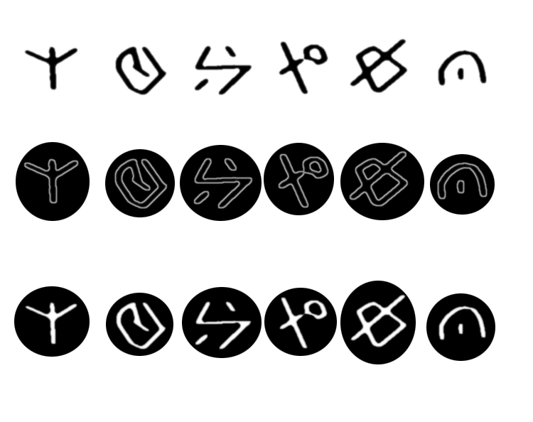
This was a rune system I designed for use as just various environmental detail to mark something important. The developers also wanted to use it as a health bar, but I don't know how that turned out. There are three versions, just for extra variety.

This is a different rune system I made, which is specifically a set of numbers representing 1-6, or 0-5, depending on how you see it. It is intended to denote the order of objects in a puzzle, so the player can keep track of their progress. This also has three versions, for variety.


Town Concept - Senseational:

Menu UI Text - Deadeye Desperado:

Deadeye Desperado required a number of text-based elements for its various menus, which I provided. If I had it my way, I would have used different fonts, but I was not able to install new fonts on the computers used to design these UI elements.

These went through a number of variations, as I was informed of additional parameters each time I submitted what I thought was a complete package. This included additional menus and colors needing to be changed.

Title Screen Concept - Deadeye Desperado:

Oct 21, 2019
CAGD 377 - Blog Post
During this sprint, I created an animation sprite sheet for the player character, as well as background images, and a dolphin for use as an enemy.
Here is the sprite sheet. It has 3 separate animations, each fairly simple; 4 frames for a forward movement, 3 frames for a jump action, and 3 frames for an attack action. As of yet, the game still uses the placeholder player character, which does not have any animation frames. These were created in Photoshop; I would have preferred to use Adobe Flash, as I feel it is more appropriate and robust in creating a set of animation frames than Photoshop, or at least I am more comfortable doing so with it.

Here is the background. It consists of 3 pieces, one simple gradient for the ocean, and two separate rocky reef outcrop layers. As they are each their own image, this hopefully will allow my team to utilize parallax scrolling. The two rock layers also fade into the background with transparency, which I don't believe will cause issues. Each piece was created by modifying a singular shape I drew using a bezier line tool, which I then cut, recolored, or transformed in any particular way. I used Krita to create these pieces. I feel it has better tools for generating and managing shapes. After this, I began creating foreground pieces that the player would actually walk on.


Here is the dolphin enemy. This is from the original character sketches I did, but had not implemented into a digital image yet as I didn't know if the team wanted it or not. It doesn't completely match the other enemy designs, namely in the outline thickness, which is an easy fix when the time comes to improve each individual image.


Here is the background. It consists of 3 pieces, one simple gradient for the ocean, and two separate rocky reef outcrop layers. As they are each their own image, this hopefully will allow my team to utilize parallax scrolling. The two rock layers also fade into the background with transparency, which I don't believe will cause issues. Each piece was created by modifying a singular shape I drew using a bezier line tool, which I then cut, recolored, or transformed in any particular way. I used Krita to create these pieces. I feel it has better tools for generating and managing shapes. After this, I began creating foreground pieces that the player would actually walk on.


Here is the dolphin enemy. This is from the original character sketches I did, but had not implemented into a digital image yet as I didn't know if the team wanted it or not. It doesn't completely match the other enemy designs, namely in the outline thickness, which is an easy fix when the time comes to improve each individual image.

Oct 6, 2019
CAGD 377 - Blog Post 3
This week, our team presented our first digital prototype build to the rest of the class for a playtest session. The elements that functioned were the player character's jump ability, as well as a level that scrolls forward automatically to keep a quick pace.
My contributions to the team involve art products. After some pencil/pen sketches over the previous sprint work session, I created digital pieces based upon those handdrawn drawings intended to refine their designs as well as choose a color scheme.
 The player character is a knight wearing an underwater diving suit. I tried to incorporate a medieval-looking helm with the waterproof/sealed bodysuit. The character has a sea hare for a mount, which is a type of sea slug. The prongs on its head are antennae that resemble bunny ears.
 The enemies were designed with the intention of being non-standard aquatic adversaries like sharks or crabs or whatever. Since the player is rescuing jellyfish, I wanted some lesser represented creatures.


First is a giant sea leech, which technically doesn't exist, but I found a strange blog with a fake news story about them, which also had a neat artistic rendition of one. The next is a stonefish, which is a highly poisonous and extremely ugly fish, and as we all know, ugly things are evil things.
 After the first playtest, I will have to figure out how the slug and player move together, as I have been assigned the creation of a set of animations for them. While I have done some small animations before, they aren't anything spectacular.
The program I will be using is Adobe Flash CS3, since I have had it for a long time and am adequately familiar with how it functions, whereas Photoshop's timeline capabilities just don't do it for me.
My contributions to the team involve art products. After some pencil/pen sketches over the previous sprint work session, I created digital pieces based upon those handdrawn drawings intended to refine their designs as well as choose a color scheme.


First is a giant sea leech, which technically doesn't exist, but I found a strange blog with a fake news story about them, which also had a neat artistic rendition of one. The next is a stonefish, which is a highly poisonous and extremely ugly fish, and as we all know, ugly things are evil things.

The program I will be using is Adobe Flash CS3, since I have had it for a long time and am adequately familiar with how it functions, whereas Photoshop's timeline capabilities just don't do it for me.
Subscribe to:
Posts (Atom)